Flexbox
Flexbox is a powerful, flexible CSS system for arranging items in a single line / along a single axis. This article only covers the very basics of flexbox. You may want to research more advanced properties and techniques on your own.
Activating Flexbox
Flexbox is activated for a group of elements by applying display: flex; to the direct parent of the elements to be placed in a row. A good mnemonic for remembering that flex properties are applied to the direct parent is:
Parents keep their children in line (pun intended). They aren't responsible for grandchildren or other decendants.
So let's look at some code. If we start with a series of elements within a shared parent:
We can apply display: flex; to the parent div, and its direct children are automatically arranged in a left-justified horizontal line, according to flexbox defaults:
Notice that the list items still stack on top of one another. This is because they are not direct children of the div that has been set to flex.
Flex Direction
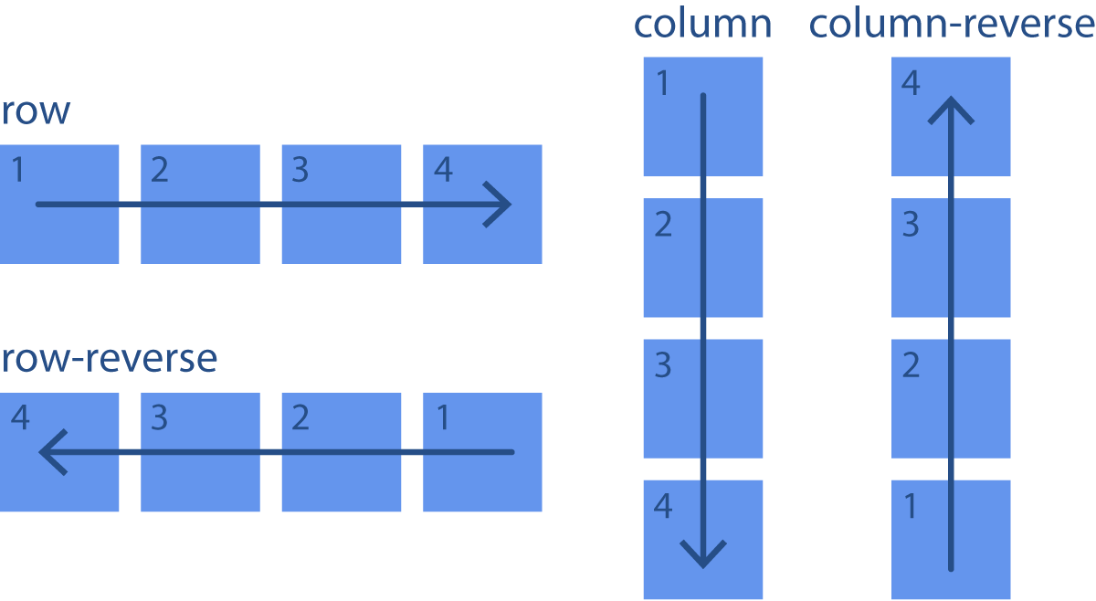
As mentioned above, by default, flex-children are arranged in a horizontal row, but we can use the flex-direction property on the flex-parent to change the direction of the line. The possible values are:
row: The default value, which places the items in a horizontal line.row-reverse: Reverses the order of elements and places them in a horizontal line.column: Places the items in a vertical line.column-reverse: Reverses the order of the items and places them in a vertical line.
The direction of specified here is referred to as the main axis.
And here is a similar example with code:
In the example above, try the different possible values for flex-direction for the .row-parent selector. Pay attention to how the children change direction and order.
Justify Content
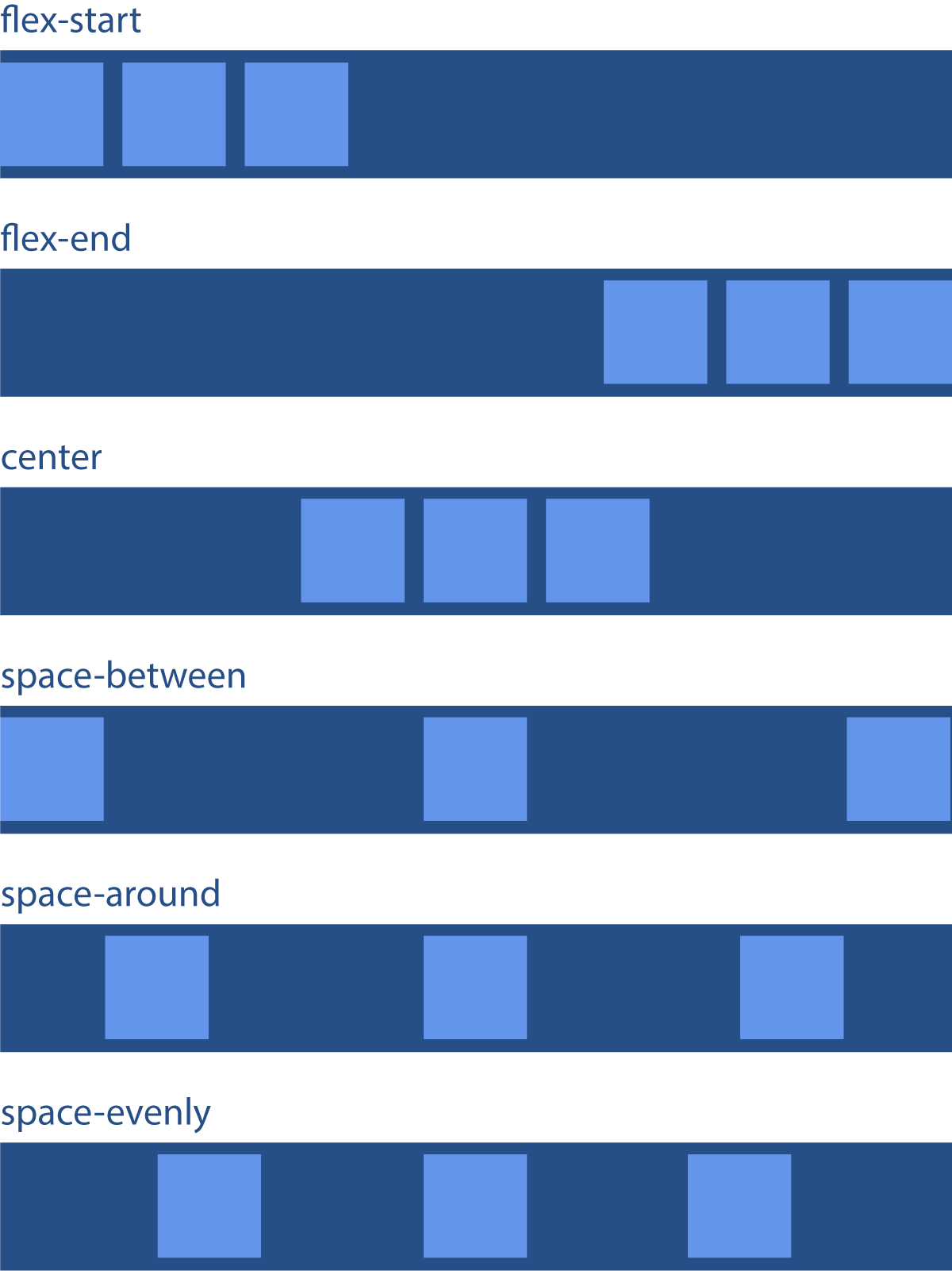
By default, flex-children are aligned along the main axis at the start of the axis line, kind of like words in a sentence. But this can be changed using the justify-content property on the flex parent. The possible values are:
flex-start: The default value, which groups the items in order at the start of the line of the main axis.flex-end: Groups the items at the end of the main axis.center: Groups the items at the very center.space-between: Distributes the items along the main axis, with the remaining space placed evenly between the items.space-around: Distributes the items along the main axis, with the remaining space placed evenly to the sides of each item.space-evenly: Distributes the items along the main axis, with the remaining space placed evenlyaround the items.
Justify-content controls how items are spaced out from one another in the container.
And a code example:
In the above example, try the different possible values for justify-content for the .flex-start-parent selector. Pay attention to how the children are redistributed across the main axis.
Margin: Auto
When margin: auto is applied to one side of a flex-child on the main axis, it serves to push that item and its neighbor as far from one another as possible. This allows an additional element of control along the main axis in addition to what justify-content allows. Notice in the following example how the main axis is defined as justify-content: space-between, but because the middle item has margin-left: auto, it is pushed all the way to the right and sits right next to the last item:
Because margin: auto in flexbox is very powerful in the layout, try to only use it if no other method is able to achieve the desired result.
In the above example, try changing margin-left to margin-right for the .example div. If you want to go further, try moving the margin to other selectors to see what happens.
Align Items
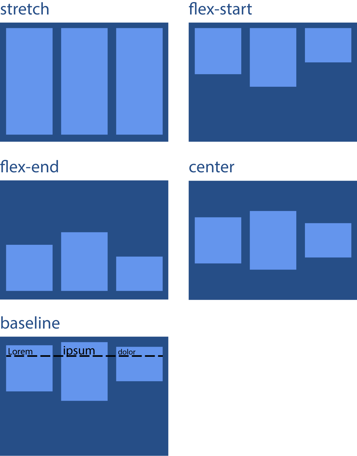
By default, flex-children are stretched so that all are equally sized along the cross axis (at least the containing box is, so a background-color fills that whole space). The position of the item along the cross axis is controlled using the align-items property on the flex parent. Possible values are:
stretch: The default value, which grows the item to fill the available space on the cross axis.flex-start: Aligns the items to the start of the cross axis line.flex-end: Aligns the items to the end of the cross axis line.center: Center aligns the items on the cross axis.baseline: Aligns the baselines of the first line of text in each item.
Align-items controls how items line up with one another.
In the above example, try the different possible values for align-items for the .stretch-parent selector. Pay attention to how the children are realigned on the cross axis.
Video Lesson
The following video demo is fully interactive. You can pause it at any time to directly edit the code, and resume playback to pickup where you left off.