Practical Challenges
These self-paced challenges will help you put into practice the skills and concepts you learn throughout this guidebook. Each challenge builds on the last one and includes examples of the completed code so you can check your work.
The Challenges
Challenge 1
As you work, don't forget to frequently save your file and check it in your browser to see how everything displays.
- Create a new root directory for this website and name it practical-challenge-site. You will use this directory as the root for this project as we continue to add to it throughout these challenges
- Inside that directory, create a new html file and name it appropriately for a site home page.
- In your new home page file, add all the standard required skeleton code, don't forget to indent properly to show which elements are inside of which other elements.
- For the
titleelement, use The Design of the 1960s. - Now, let's move inside of the
bodyelement for the rest of our work. Remember, thebodyelement is what holds all the content that shows up on the webpage for users. - First, let's add an
h1element to serve as the primary heading for the page. Inside the element write The Design of the 1960s, just as you did in thetitleelement above. - Next, add a paragraph with the following text:
The nineteen-sixties were a vibrant time in the world of design in which increasing internationalism and experimentation flourished. This website pays tribute to some of the great designers and landmark design moments of that pivotal and unforgettable decade.
- In the paragraph you just added, we want the user to know that the time period is important, so place the word nineteen-sixties in the appropriate HTML element to indicate importance.
- Let's also add a little emphasis to the words internationalism and experimentalism by adding the appropriate HTML element to them.
- Below the paragraph, add a new heading to indicate a sub-section of the page. The heading should be the appropriate number level to indicate that it is a direct sub-section of the
h1that describes the page above. The text of the heading should say Significant Designers. - Below the heading you just added, create an unordered list (including the nesting shown) of the following names:
- Paul Rand
- Muriel Cooper
- Ikko Tanaka
- The
- Ray Eames
- Charles Eames
- Saul Bass
- Margaret Calvert
- Yusaku Kamekura
- Herb Lubalin
- Shigeo Fukuda
- Milton Glaser
- Massimo Vignelli
- After the unordered list, add another heading at the same level of hierarchy as the previous section heading and use the text Top Typefaces of 1960s Style.
- After this heading, we'll use another list, but since the list is ranked let's make it an ordered list. Here are the items to include:
- Avant Garde
- Cooper Black
- Futura
- Helvetica
- Univers
- Eurostile
- Impact
- Sabon
- Bauhaus
- Baby Teeth
- Finally, after the list of typefaces, let's add a credit to show who created this website. In the appropriate element for text that is less important add the text Website by Your Name.
- Congratulations! You've completed this challenge! Now download the finished version and compare your work to it, making sure to check that:
- All of your HTML elements are opened and closed in the correct places
- You have used proper spacing and capitalization.
- Your elements are correctly indented to show which elements are children of other elements.
Challenge 2
As you work, don't forget to frequently save your file and check it in your browser to see how everything displays.
- This challenge builds on the previous challenge, so open up the
index.htmlfile from last time to get started. If you didn't finish the previous challenge or haven't had time to make corrections, you can download the starter files above, which contain a completed version of the last challenge, and work from that instead. - Now that we have the basic page content that we added in Challenge 1, let's add more meaning to the page by making use of the HTML5 semantic elements. We'll start by wrapping all the content inside the
bodyelement except for thesmallat the end of the page in the appropriate element for the primary content of a page. Be sure to update your indentation to show the new parent/child relationship between elements. - Inside the element you just added, find the
h2that says "Significant Designers" and the unordered list of designer names. Wrap both that heading and the list in the element that means a group of thematically related content. - Now use another instance of the same element you used in Step 3 to wrap the
h2that says "Top Typefaces of 1960s Style" along with the unordered list of typefaces. - Now let's turn our attention to the
smallelement at the end that contains the "written by" statement. Wrap that element in the semantic element that refers to information about the creator or creation of a page or article. - Now our page has semantic elements for the primary content and for the creator's credit, but it lacks anything to introduce the site. Above the element for primary content that you added in Step 2, just after the opening
bodytag, add the semantic element for introductory content about a page or article. - Inside the element you just added, let's add some text that will serve the role of our site's logo. Since there is no element specifically for logos, add a block element that is meaningless and fill it with this text: The History of Design, which will be the name of our site as a whole.
- Let's add some visual interest to the site by adding an image. But first, we need a place to put the image file. We could place it directly in our root directory, but keeping images with all the pages could lead to poor organization down the road. Instead, directly inside your root directory, create a new directory named images.
- Download this image file and place it inside your new images directory.
- Now, back in your
index.htmlfile, directly below theh1and above the paragraph, add the HTML to include the image on your page.- Remember to include the required attribute for users who can't see the image. Use the text: Rock and Roll Poster.
- Be sure to save and check your page in the browser to ensure the image shows up.
- Congratulations! Another challenge complete! Now download the finished version and compare your own work against it, making sure to check that:
- The new elements match what you have and are in the same places.
- Your elements are correctly indented to show which elements are children of other elements.
- All elements are closed correctly.
Challenge 3
As you work, don't forget to frequently save your file and check it in your browser to see how everything displays.
- This challenge builds on the previous challenges, so open up the
index.htmlfile from last time to get started. If you didn't finish the previous challenge or haven't had time to make corrections, you can download the starter files above, which contain a completed version of the last challenge, and work from that instead. - So far we've only used HTML to add content to this site, but it looks really plain, so let's begin adding some style. The first thing we'll need to do is add a CSS file named style.css directly inside the root directory of the website.
- But our HTML file doesn't yet know about the CSS file. In the
headofindex.html, add the necessary code to tell the browser to use the CSS file you just created. - One of the primary factors that determines the look and feel of a design is the type, so let's get started by setting a typeface for all the body copy. In your CSS file, select for the HTML element that contains all other HTML elements and apply this font stack: Georgia, Times, "Times New Roman", serif. Selecting the topmost parent element like this should result in the type being used by all elements on the page.
- Now the spacing between the lines in the body copy feels too tight. Let's fix that by setting the space between lines to
1.5. (Notice that we don't need a unit for this measurement.) - To add a bit of variety to the site, in your CSS select for
h1,h2, andh3(there aren't any h3s on the page yet, but we may add some in the future) and apply this font stack: Arial, "Helvetica Neue", Helvetica, sans-serif.- What is the most efficient way you can write the CSS to apply this font stack to the headings listed?
- Note that because this is applied to specific elements within the element you used in Step 4, the font overrides the Georgia fonts for these headings.
- While we're styling the headings, let's add some other styles for a bit of flavor. To the same three headings you used in the previous step, give them a text color of #AE053E.
- To make the page title really stand out, do the following to just the
h1:- Make the text all capital letters using CSS.
- Make the type a regular weight instead of the default bold.
- Add
.1remof extra spacing between all the letters.
- To make the page feel a little more impactful, let's increase the size of the headings to the following values:
- Make the
h1elements3.5rem. - Make the
h2elements2rem. - Make the
h3elements1.5rem.
- Make the
- Finally, since the first paragraph on the page explains what the website is all about, let's give it some special visual treatment. Since we want to apply these styles only to this one particular paragraph and not all paragraphs we might add in the future, we can't select it using the
pelement. So do the following instead:- In your HTML file, add a class of site-intro.
- Back in your CSS, select for the class you just added and set the type size to
1.25rem.
- All done! Now download the finished version and compare your own work against it, making sure to check that:
- Your CSS is correctly formatted, with proper indentation, spacing, and alphabetized properties.
- You have selected for the different headings in the most efficient way possible.
- The class you added to your HTML is formatted correctly.
Challenge 4
As you work, don't forget to frequently save your file and check it in your browser to see how everything displays.
- This challenge builds on the previous challenges, so open up your files from last time to get started. If you didn't finish the previous challenge or haven't had time to make corrections, you can download the starter files above, which contain a completed version of the last challenge, and work from that instead.
- Right now, all the content stretches all the way across the page, with almost no space at the edges, and on wide browsers the lines of body text can become too long to read comfortably. To fix this, in your CSS set the
mainelement to never grow wider than38rem. - That's better, but the content now sits to the left side of the page on browsers that are wider than
38rem. To fix this, use margin to horizontally center themainin the available space. - Now that the formatting is looking better, let's pay attention to some details. The Significant Designers section of the page has an unordered list that looks a little plain. Use CSS to set all unordered lists to show a square instead of a black disc as the list item marker.
- That looks good, but the nested list shouldn't show the same marker as the parent list. Set the list marker of nested unordered lists to be a hollow circle.
- On a related note, for fun let's change the ordered lists to use numbers with a leading zero instead of the standard single digit style.
- As our page takes shape I'm noticing that some of the headings still look a little plain. To fix this, let's make the following changes to all
h2elements:- Give them a solid line border across the bottom that is 5px thick and the same color as the text.
- Add .5rem of space between the bottom of the text and the border.
- Add the following space between the element and the surrounding contents: 4rem of space on top, no space on the sides, and 2rem of space on bottom.
- Lastly, let's start planning for when we add additional pages to this website. Specifically, in
index.htmllet's add a list of items to serve as the main navigation of the site by doing the following:- Inside the page's
headerelement, just after thedivwith the site name, add the semantic element appropriate for page navigation. - Inside the element you just added, write an unordered list that contains the following items (just the text for now; we'll make them links in a future challenge):
- Home
- About
- Contact
- To the list as a whole, add a class of site-nav-list so we can target it in our CSS and style it differently from other unordered lists.
- Inside the page's
- The navigation list we just added contains the right information, but it doesn't look how users expect navigation to look. To fix this, jump back into your CSS file and do the following:
- Change the display property of the list items so that they sit side-by-side. Remember, you only want to affect the list items in this navigation list, so you'll need to be sure to write a CSS selector that only targets list items within the "site-nav-list" unordered list.
- On the "site-nav-list" list itself, there's some default space inside the element on the left side. Remove the default space from the list.
- That's it for this challenge! Now download the finished version and compare your own work against it, making sure to check that:
- You have used the correct selectors for everything you added to your CSS.
- You have chosen correctly between the margin and padding properties everywhere that you changed spacing.
- You used shorthand where possible for margin and padding.
- All your CSS properties are nicely alphabetized within the selector blocks.
- You added the correct semantic element in your HTML.
Challenge 5
As you work, don't forget to frequently save your file and check it in your browser to see how everything displays.
- This challenge builds on the previous challenges, so open up your files from last time to get started. Or you can download the starter files above, which contain a completed version of the last challenge, and work from that instead.
- So far, our website is very self-contained. Let's broaden our horizons a bit by setting up some links. In the introductory paragraph of
index.html, make the words "landmark design moments" a link that points to this article: https://www.printmag.com/post/vintage-graphic-design-ads-1960s. Be sure to test the link in your browser to make sure it works correctly. - Now, let's do some linking within our own website. First we'll need to create at least one more page:
- Inside your root directory create a new directory named: designers.
- Create a new HTML file in your designers directory and name it ikko-tanaka.html.
- In the new HTML file, add all required skeleton code and for the
titleelement use: Ikko Tanaka | The Design of the 1960s. - Also in the new HTML file, add the link to your CSS file, making sure the file path that correctly points to
style.cssin the parent of the current directory. - Inside the
bodyelement, copy and paste in from the home page theheaderandfooteralong with their contents, then between them add an emptymainelement to hold the unique content we'll write for the page. - Inside the newly added
mainelement, add a top-level heading that says Ikko Tanaka. - Below the heading, add two paragraphs with the following content:
Born in Nara, Japan in 1930, Ikko Tanaka created a style of graphic design that fused modernism principles and aesthetics with the Japanese tradition. As a child he studied art and as a young adult he was involved in modern drama and theatrical study groups. In 1963 he formed Tanaka Design Studio where he worked for corporations such as Mazda, Hanae Mori, Issey Miyake and the International Garden and Greenery Exhibition.
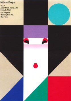
He is most well-known for his poster design for the Nihon Buyo performance by the Asian Performing Arts Institute. The poster (pictured above) shows his fusion of modernist sensibilities and traditional Japanese culture through the simplified illustration of a geisha. He designed, among other things, posters, logos, packaging and annual reports. Among his wide ranging work, his designs for the symbols for the Expo '85 in Tsukuba and the World City Expo Tokyo '96 garnered much attention. He died in 2002 of a heart attack at the age of 71.
- Because all of this information could stand alone if taken out of context it, wrap everything inside the
mainelement in the appropriate semantic element for content that could stand alone as its own document.
- Now let's briefly switch back to
index.html. In the list of significant designers, find Ikko Tanaka's name and link it to the new page about him. Remember to think about the designers directory when writing the path of your link. Make sure the link is placed inside the list item, not the other way around. - Back in
ikko-tanaka.html, let's provide a way for users to get back to the home page. We've already added home as one of the list items in thenavof our pageheader, so link that to the home page, remembering to consider the directory relationship between files when you write the file path. - We want to keep the navigation the same on all pages, so copy the modified home link from
ikko-tanaka.htmland paste it in to replace the existing home item in the home pagenav>. Then modify the link for home so that it correctly links to itself. (It's pretty common for page navigation to have links that point to the current page.) - Finally, let's move into our CSS file and add some styles for all our links and their various possible states:
- For default links, change the text color to: #006EAC.
- For visited links, change the color to: #2A4758.
- For hovered links, change the color to: white, and set the background color to: #006EAC.
- For focused links, change the color to: white, and set the background color to: #AE053E.
- For active links, change the color to: white, and set the background color to: black.
- That's it for this challenge! Now download the finished version and compare your own work against it, making sure to check that:
- All your links work as intended.
- Nothing is missing from your new HTML.
- All the styles for your link states are written correctly and work as intended.
Challenge 6
As you work, don't forget to frequently save your file and check it in your browser to see how everything displays.
- As always, this challenge builds on previous challenges, so open up your files from last time to get started. Or you can download the starter files above and work from that instead.
- Let's start in the
ikko-tanaka.htmlfile that was created in the last challenge. Since we're talking about Tanaka's design work, it would be good to show a visual example. To do so:- Download this image of one of Tanaka's posters to your images directory.
- In your
ikko-tanaka.htmlcode, below theh1, add the image to the page. Remember as you write the file path to the image that your current file is in a sub-directory. - For the
altattribute, use the text Nihon Buyo poster by Ikko Tanaka.
- Since this image helps users to understand Tanaka's design, wrap the image in the appropriate semantic element that means a visual example of the topic referenced in the text.
- The default styles for the element you just added in step 3 add a bit of awkward space to the left side of the image. Use your developer tools to figure out what is causing the extra space and, in your CSS file, remove the space from the left side of this type of element.
- Now, let's make some more specific design changes. Since we don't want to affect all image examples, we'll need to first add the following class to the element you added in step 3: design-example. Now we can reuse the same class for similar examples on pages about other designers.
- Now, in your CSS, select for the
design-exampleclass and do the following:- Make it so the element will never be wider than 30% of the parent.
- Make it so the element moves to the right side of the parent with the text wrapping around its left side.
- We don't want the text to butt up against the image awkwardly, so add
1remof space on both the left and bottom sides of the element.
- If you save your files and check them in your browser, you'll notice that the image actually hangs out of the column of the text. This is because we've set the element that contains it to a size smaller than the image file itself, so we need to tell the image to shrink to fit within its parent. It's a good idea to make this adjustment to all images everywhere so we don't run into the same problem again. To do so, in your CSS select for all image elements and apply the following:
- Set images to never grow wider than 100% of the parent.
- While we're at it, let's make the behavior of images more predictable by setting images to behave as a block element rather than as an inline element.
- Now let's switch gears. When we chose our typefaces for the site we didn't know yet how to use webfonts and so we used system fonts. Now, let's take advantage of a wider selection by implementing some Google Fonts:
- Go to Google Fonts and select the bold weight only of Oswald and the regular, regular italic, and bold weights of Merriweather.
- Add the Google Fonts embed code to the
headof each HTML file in your project. - In your CSS, replace the font declaration on the
HTMLelement with Merriweather. - In your CSS, replace the font declaration for the headings with Oswald.
- Since we only brought in the bold weight of Oswald, remove the declaration that sets the
h1to have a normal font weight.
- That's it, another challenge complete! Now download the finished version and compare your own work against it, making sure to check that:
- You've used the correct semantic element for your image.
- You've styled the image and its parent element correctly in your CSS.
- You have the correct embed code for the Google Fonts.
- Double check your indentation.
Challenge 7
As you work, don't forget to save your file and check it in your browser to see how everything displays.
- As always, this challenge builds on previous challenges, so open up your files from last time to get started. Or you can download the starter files above and work from that instead.
- We've made a fair amount of progress toward styling our site, but the pages still look a little plain. Let's add a background color to spice things up. To the element that holds all other elements on the page, add the following background color: #FFFEF4. It's subtle, but it adds a nice warmth.
- Now to add some real excitement to the design with a background image:
- Download this image to your images directory, then apply it as a background image to the
htmlelement. - Set the background image so that it only repeats vertically, not horizontally.
- To make sure the background image doesn't interfere with any of the content of the page, give the
htmlelement 40px of padding on its left side.
- Download this image to your images directory, then apply it as a background image to the
- Next, we'll create a more interesting and attention-getting hero area for the home page:
- In
index.html, remove the image that is placed directly after theh1element. - Then, wrap the
h1in a meaningless block element, and give the element a class of hero. - Download this image to your images directory, then apply it as a background image to the element with the class of
hero. - The element is too short to show much of the newly added background image, so set it so that it is always at least 38rem tall (the same as the
mainelement's width). - The background image is still a little too big, so set the background image to always show as much of itself as possible while filling the entire container.
- To make the text work better with the image, set the hero so that any text it contains will be center aligned.
- The only problem now is that the text is a bit hard to read in some places. To fix this, give only the
h1inside the hero a white text shadow. (No otherh1on the site should be affected.) The shadow should be offset 5px to the right, 5px to the bottom, and have no blur.
- In
- It's a good idea to give users a suggested action to perform when they first get to the site, so let's create a call to action link:
- Inside the hero
div, add a new anchor link that points to the Significant Designersh2further down the page. (Hint: You'll need to add something to theh2. You decide what to call it.) - So that we can style it separately from other links, give the link you just added a class of call-to-action.
- In your CSS, give the call to action link a background color of #0070B0, and make the text white.
- To give the text some breathing room, give the link padding of 1rem on the top and bottom, and 1.5rem on the sides.
- To make things a little cleaner and easier to read, make the text bold and remove the underline.
- Round the corners of the box by .5rem to soften things up.
- Finally, to make the link stand out from the background image add a white shadow to the box. The shadow should be offset 2px to the right, 2px to the bottom, and be blurred 6px.
- Inside the hero
- That's one more challenge complete! Now download the finished version and compare your own work against it, making sure to check that:
- The new HTML in your
index.htmlfile is correct. - You've used all the correct styles for your background images.
- Your shadows and rounded corners use the correct values.
- The new HTML in your
Challenge 8
As you work, don't forget to save your file and check it in your browser to see how everything displays.
- As always, this challenge builds on previous challenges, so open up your files from last time to get started. Or you can download the starter files above and work from that instead.
- So far, we've left the header of the page fairly plain looking. Let's go ahead and add some styles:
- In your CSS, select the
headerelement and give it a background color of #0070B0 and a text color of white. - Now the link is really difficult to see against the blue, so give only links in the header a text color of white and also give them an underline to make sure users can tell they are clickable.
- Finally, for a bit more breathing room, separate the text from the edges of the box by giving the header 1rem of inside space on the sides and .75rem of inside space on the top and bottom.
- In your CSS, select the
- Now that we've adjusted the overall look of the header, let's modify its position and behavior. Set the header so that:
- It stays in place in the window as the user scrolls.
- It is flush against the top of the window.
- It stretches all the way from the left edge of the window to the right edge of the window.
- Now the header covers some of the content of the page. To fix this, add 12rem of margin to the top of the
body. - Now, let's turn our attention back to
ikko-tanaka.html. It might be nice to allow users to favorite this article for later. Just after theh1of the page, paste in the following SVG code:<svg xmlns="http://www.w3.org/2000/svg" width="50" height="50" viewBox="0 0 24 24" fill="none" stroke="currentColor" stroke-width="2" stroke-linecap="butt" stroke-linejoin="arcs" class="favorite-icon"> <title>Favorite Icon</title> <path d="M20.84 4.61a5.5 5.5 0 0 0-7.78 0L12 5.67l-1.06-1.06a5.5 5.5 0 0 0-7.78 7.78l1.06 1.06L12 21.23l7.78-7.78 1.06-1.06a5.5 5.5 0 0 0 0-7.78z"></path> </svg> - You should now see the icon as a heart shape below the heading. We won't worry about making it clickable since we would need javascript to implement a favoriting system, but we can still style it how we want to:
- The icon has a class of
favorite-icon, so use that it select it in your CSS and apply a text color of #AE053E. (Part of the SVG code tells it to use the applied text color as the color of the icon.) - Select the
articleelement, and set the position so that it can serve as the positioning canvas of its children. - Set the position of the icon so that it will be positioned with reference to the
article(based on the change you just made). - Set the icon so that it is placed 1.2rem down from the top edge of the article and -4rem (note the negative number) out from the left edge of the article.
- When you're done, the icon's position should look like this:
- The icon has a class of
- Nice work! Now download the finished version and compare your own work against it, making sure to check that:
- The new HTML in your
ikko-tanaka.htmlfile is correct. - All your positioning and directional properties are correct in your CSS.
- You have used the correct
positionproperty on thearticleelement.
- The new HTML in your