Grid
Grid is powerful, flexible CSS system for arranging items in a two-dimensional grid. This article only covers the very basics of grid. You may want to research more advanced properties and techniques on your own.
Terminology
- Grid Parent
- The wrapping element to which most grid properties should be applied. This should be the direct parent to the elements that will be arranged into grid cell.
- Grid Children
- The direct child elements to the grid parent. These are the elements that will be arranged to fit in the grid cells.
- Grid Cells
- The spaces defined by the intersections of grid columns and grid rows, similar to the cells in a spreadsheet. The grid children are arranged into these.
- Grid Lines
- The lines that defined the edges of grid columns or rows. These are numbered from left to right and top to bottom, respectively. They are important for positioning individual grid children into specific grid cells.
You can think of the grid parent as a parking lot. The grid cells are the parking spaces, created by the grid lines that define the edges of the rows and columns of the parking lot. Finally, the grid children are the cars that can go into the parking spaces.
Activating Grid
Like Flexbox, grid is activated for a group of elements by applying display: grid; to the direct parent of the elements to be placed in a row.
Remember that grid parents affect only their direct children. They aren't responsible for grandchildren or other decendants.
So let's look at some code. If we start with a series of elements within a shared parent:
We apply display: grid; to the parent div, but nothing seems to happen:
This is because the grid layout is undefined. Grid has been activated, but there are no grid cells into which the grid-children can be placed. For that we'll need Grid Template properties.
Grid Template
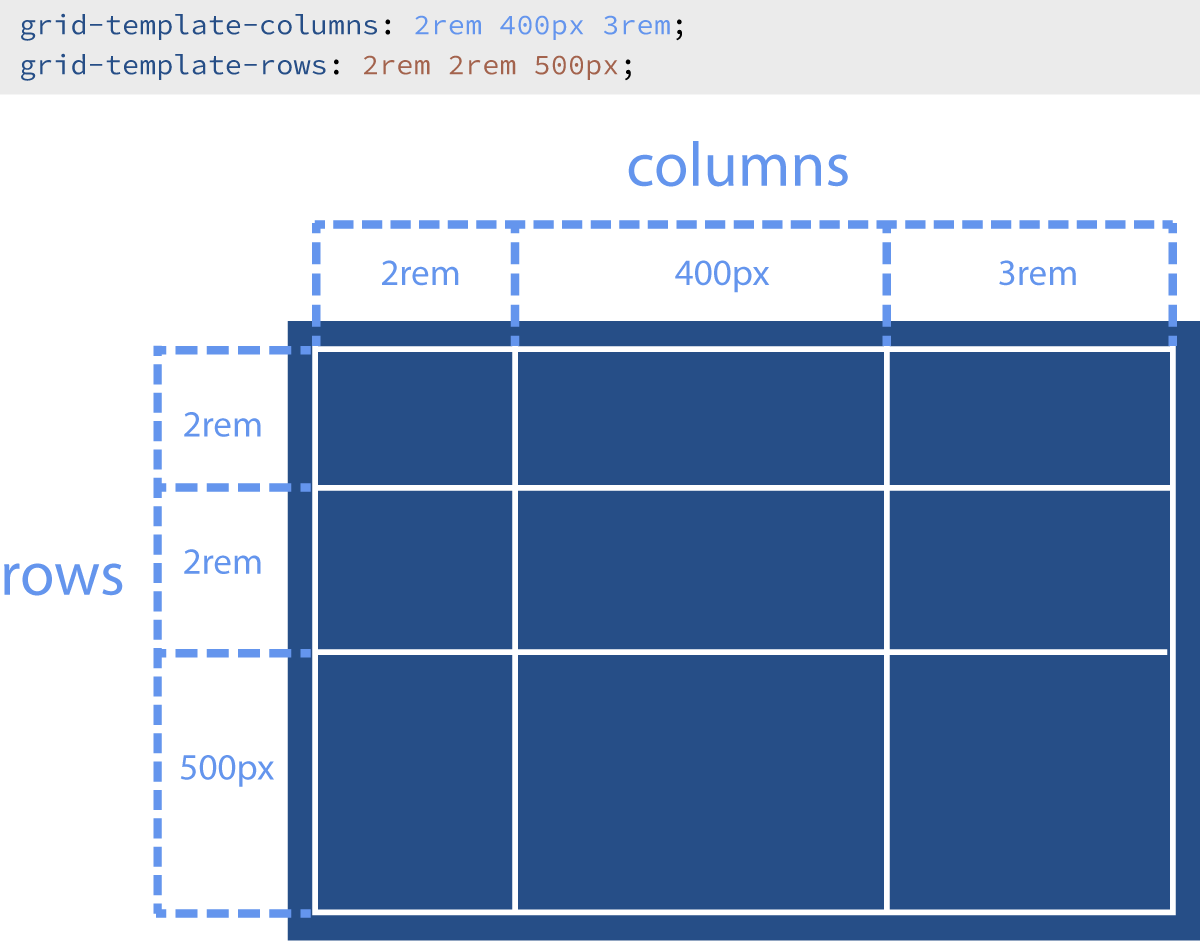
The grid-template-columns and grid-template-rows properties allow us to define any number of columns or rows, respectively, into which the grid-child elements will be placed.
By default, there are no grid columns, and grid rows are generated automatically based on the content.
For each of these properties, you can define any number of columns/rows by providing a size measurement value for each. Each size value should be separated by a space. So lets look at a code example:
In the example above, see what happens when you change the values for the grid template properties. Try adding or removing values (remember that values must be separated by a space). What happens when you mix measurement unit types?
The result is that the divs are arranged into three columns (because three values are provided for grid-template-columns), and the columns are 100px wide, 200px wide, and 300px wide, respectively. And the divs are arranged into two rows (because two values are provided for grid-template-rows), and the columns are 4rem tall and 2rem tall, respectively.
The number of columns depends on the number of sizes provided in the grid-template-column value.
Automatic Rows
It's important to reiterate here that additional grid rows are added automatically whenever there is more content than the explicitly defined rows can contain. (Because of this, it is sometimes beneficial to not define any explicit rows, and instead rely entirely on automatic rows.) These new automatic rows are sized based on their contents. Let's look at what happens when we only define one explicit row:
In the example above, try adding new rows and notice how the divs resize to match the value(s) you provide.
Notice how only the first row is sized to match the value provided for grid-template-rows. The remaining divs are placed in new rows as needed, but those rows are sized automatically to fit the divs.
The number of rows depends on the how much grid-child content is present.
The fr Unit
In the examples so far, we have used fixed CSS units that don't grow or shrink with the container. If we wanted to make the grid fluid, we could use percentage units, but percentages can be tricky (especially when combined with grid gap, which we'll explore shortly). Luckily, CSS Grid gives us the new fr unit. The fr unit represents a fraction of the space available.
You can think of the fr unit as being sort of like "parts" in a recipe. "One part milk, two parts flour" means that no matter the size of serving, there will always be three equal parts in total.
Basically, the total number of frs given is divided by 100, and the result is the percentage of space each fr is allotted. Let's look at a couple of examples to make sense of this:
grid-template-columns: 1fr 1fr 1fr 1fr;— Here there are a total of four frs given, so each fr is 25% of the available space (1/4 of 100%).grid-template-columns: 1fr 1fr 2fr;— Here there are still a total of four frs given, and each fr is 25% of the available space, but they are distributed differently, with the third column receiving two of the frs, or 50% of the available space.grid-template-columns: 1fr 500px 1fr;— Here there is a column defined in pixels, so that pixel amount is first subtracted from the available space. Then the remaining space is divided evenly between two frs expressed. They each get 50% (1/2 of 100%) of the space left.
In the example above, try changing the numbers of frs in the values. Try adding new columns with fr units. Try mixing in pixel or rem values for a column.
Repeat Shorthand
When you want several rows or columns that all have the same size value in a grid template, you can use the repeat shorthand to write more efficient code. The word repeat is followed immediately by parenthesis. Inside the parenthesis, the first value sets the number of columns. The second value, placed after a comma, sets the size for the columns. It looks like this:
So repeat( 3, 5rem ) would create three columns of 5rem each. And repeat( 4, 20px ) would create four columns of 20px each.
The repeat shorthand can be mixed with normal template values, so 100px repeat( 2, 8rem ) would create one column of 100px, followed by two columns of 8rem each.
Grid Gap
Often, you want space between the rows and/or columns of a grid. You could apply margin directly to the grid-children, but that can be unwieldy. To make this easy, CSS grid provides grid-column-gap, grid-row-gap, and grid-gap, which is a shorthand for combining the previous two. For grid-gap, a single value is applied to both rows and columns.
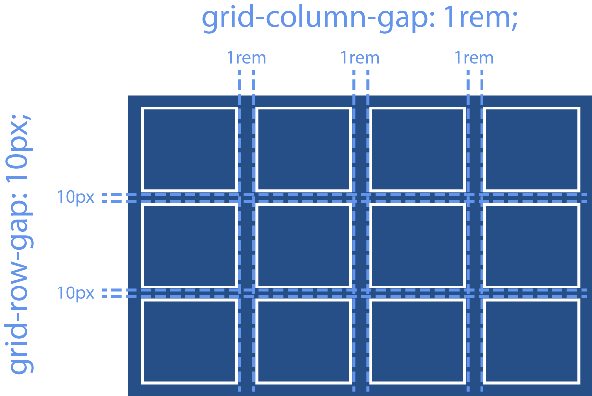
In the example above, try changing the values for the grid gap properties. Try removing grid-column-gap and grid-row-gap, and replace them with grid-gap with a single value. Notice how that one number is used for both the row and column gaps.
Justify Items
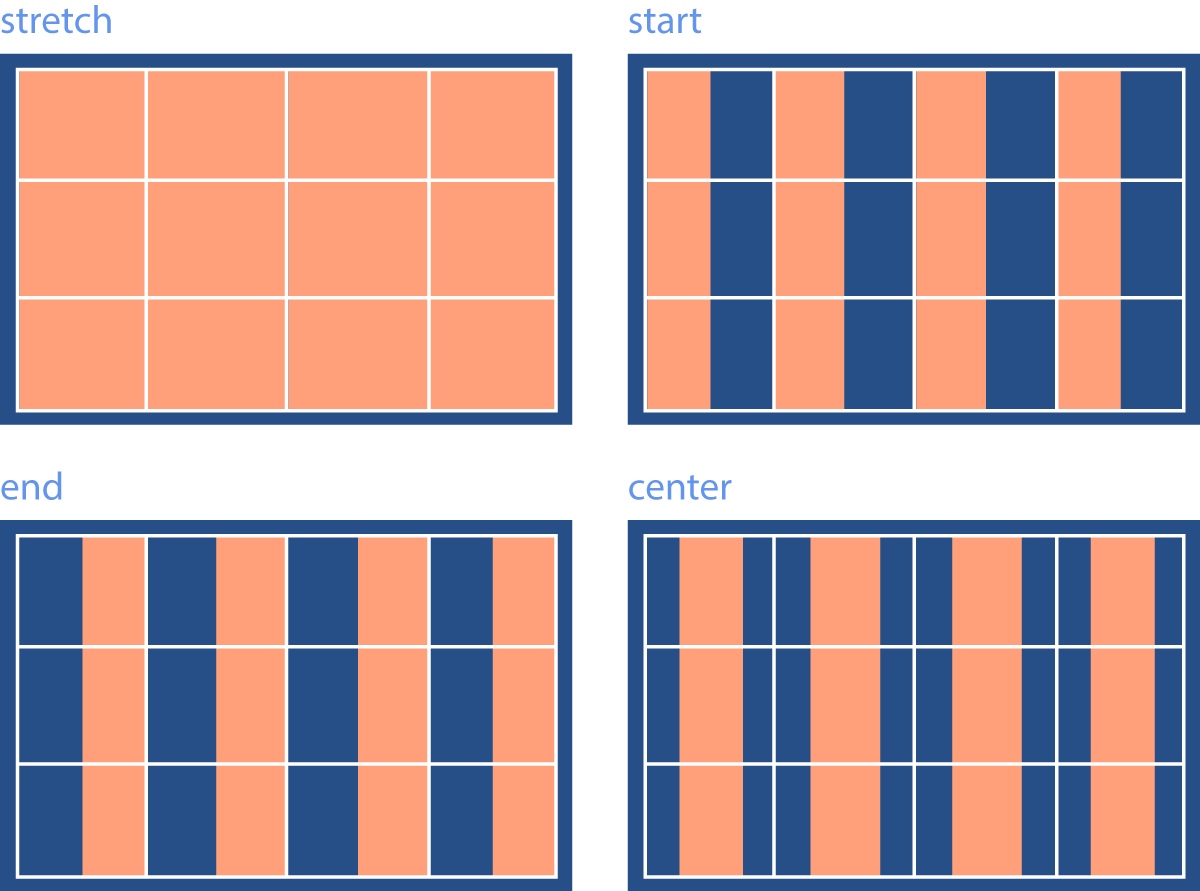
When the content of a grid-child isn't large enough to completely fill the width of the column that contains it, justify-items is used to adjust how the child behaves on the horizontal axis. The possible values are:
stretch: The default value, in which the grid child is stretched to fill the entire width of the column.start: The grid child is only wide enough for its content and is left-aligned within the column.end: The grid child is only wide enough for its content and is right-aligned within the column.center: The grid child is only wide enough for its content and is horizontally centered within the column.
In the example above, try out different possible values for justify-items. Can you center the grid children in the cells? Can you place them on the right sides of the cells?
Align Items
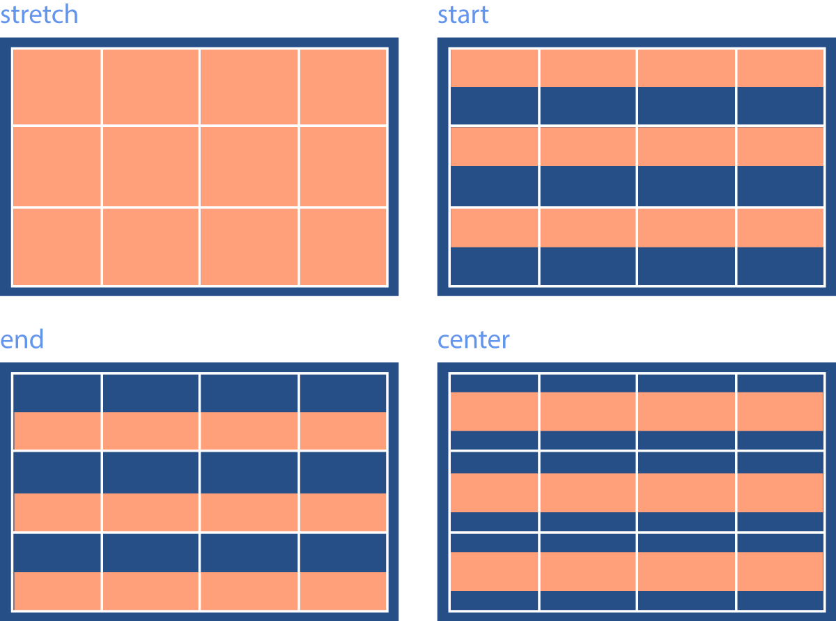
Now the other direction. When the content of a grid-child isn't large enough to completely fill the height of the row that contains it, align-items is used to adjust how the child behaves on the vertical axis. The possible values are:
stretch: The default value, in which the grid child is stretched to fill the entire height of the row.start: The grid child is only tall enough for its content and is top-aligned within the row.end: The grid child is only tall enough for its content and is bottom-aligned within the row.center: The grid child is only tall enough for its content and is vertically centered within the row.
In the example above, try using the different possible values for align-items. Can you vertically center the grid children in the cells? Can you place them on the tops of the cells?
Positioning Grid Children
Sometimes, we want to control where in the grid a particular grid child should fit. Sometimes we want a single cell to span multiple grids or rows. Or maybe we want to leave some grid cells empty. There are a great many sophisticated layouts that can only be achieved with this granular level of control over individual grid children. To do this, we can make use of the grid-column-start, grid-column-end, grid-row-start, and grid-row-end properties on a grid child.
To use these properties, it is necessary to understand that grid columns and rows have numbered lines associated with their edges called grid lines. This is best explained with an illustration:
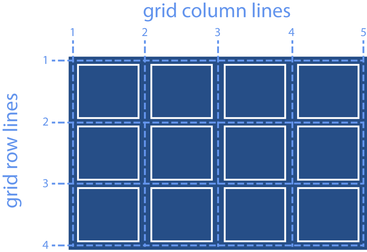
We can tell a grid child to start at a particular grid line and to end at another grid line for each direction.
In the example above, see what happens when you change the values for the start and end properties. Can you make div 1 start at the second row instead? Can you make div 2 only occupy the third column?
When you manually position some grid children, the remaining children do their best to adjust accordingly. Unfortunately though, sometimes manually positioning some grid children means you will have to manually position the rest as well to achieve the desired result.
Video Lesson
The following video demo is fully interactive. You can pause at any time to directly edit the code, and resume playback to restore to where you left off.