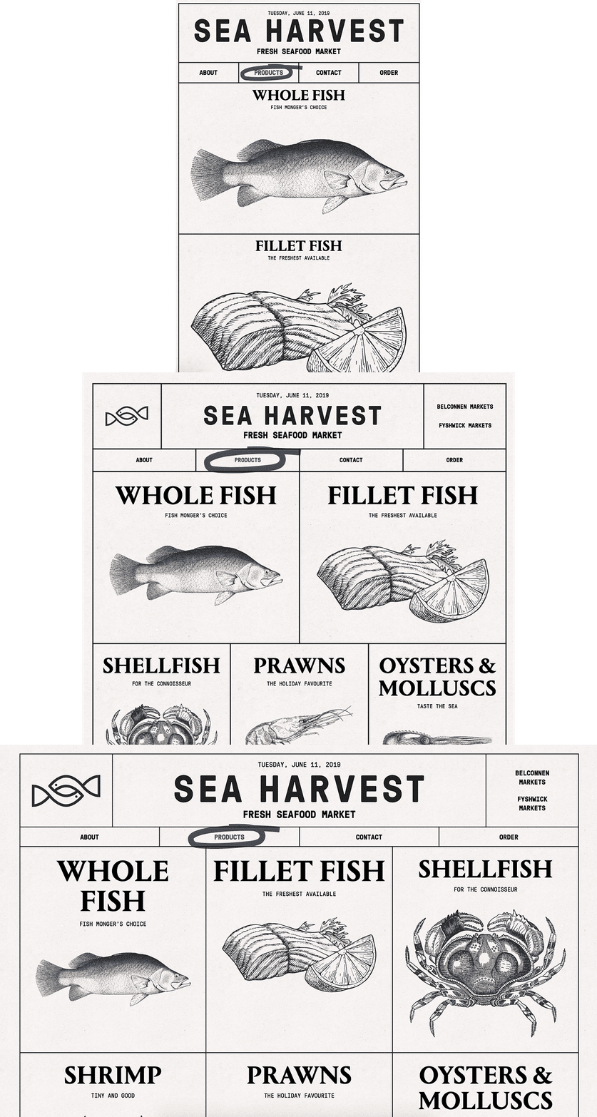
Responsive Design
Responsive Design is a method for making sure a webpage looks good on all browser sizes, from small phones to ultra-wide desktop monitors. CSS media queries detect the size of a user's browser and accordingly implement different CSS styles. By using a series of media queries and strategic CSS overrides, you can create very different experiences for different browser sizes with a relatively small amount of extra code.
Mobile First
Because smaller browser viewports usually call for less complexity that a webpage in a large viewport, it is considered best practice to start with CSS for the smallest possible size and add complexity with media queries for larger and larger viewports. This practice is referred to as the mobile-first method.

Media Queries
A media query is basically an if statement for CSS. It basically tells the browser, "If the criteria here are met, apply the CSS contained within." Or, more specifically for the following example, "If the browser window is at least 400px wide, make the paragraph text green."
The term breakpoint refers to the size at which a change in CSS is triggered.
In the demo above, try grabbing the bottom-right corner of the demo and dragging to resize it to see how it behaves. Notice how the text is only green when the preview window is wider than 400px.
Media queries can contain multiple declaration blocks for different selectors.
In the demo above, notice how the single media query contains multiple selector blocks, each with their own styles. Try resizing the demo to see the media query working.
Overriding existing styles
Any CSS inside a media query is read by the browser as an override to any CSS that has already been applied. This means that any CSS written outside any media queries is applied unless a media query specifically overrides it. And because that CSS is outside a media query, it is applied starting at a browser width of 0px. Another effect of this logic is that there is no need to repeat previously applied properties within a media query if the value doesn't change.
It's like Newton's First Law: Properties that are set tend to stay set unless acted upon by another media query.
Or, you can think of it like speed limit signs: When you see one, you can keep going that speed until you see a sign telling you something different.
Try resizing the demo above. Notice how the color of the text changes to green at sizes above 400px. But also notice how the text remains sans-serif at all sizes because the media query hasn't specifically changed it. What happens if you add more styles outside the media query? Are they still applied when the window is larger than 400px?
Multiple Media Queries
A webpage usually needs more than one media query to work at all possible browser sizes, and it is common to use a series of media queries targeting ascending browser widths. In such cases, the same logic mentioned above is followed from media query to media query: Any CSS that has been applied from a previous media query stays applied until a new media query specifically overrides it. For instance:
Try resizing the demo above. Pay careful attention to how both the color and font size change when the preview is wider than 400px, and how the font size grows more when wider than 500px. Notice how the type remains sans-serif throughout, and how the text remains green even above 500px.
Video Lesson
The following video demo is fully interactive. You can pause at any time to directly edit the code, and resume playback to restore to where you left off.